Peter Uzzi
Product + Design Leader
Redesigning an iconic consumer credit tool

Background
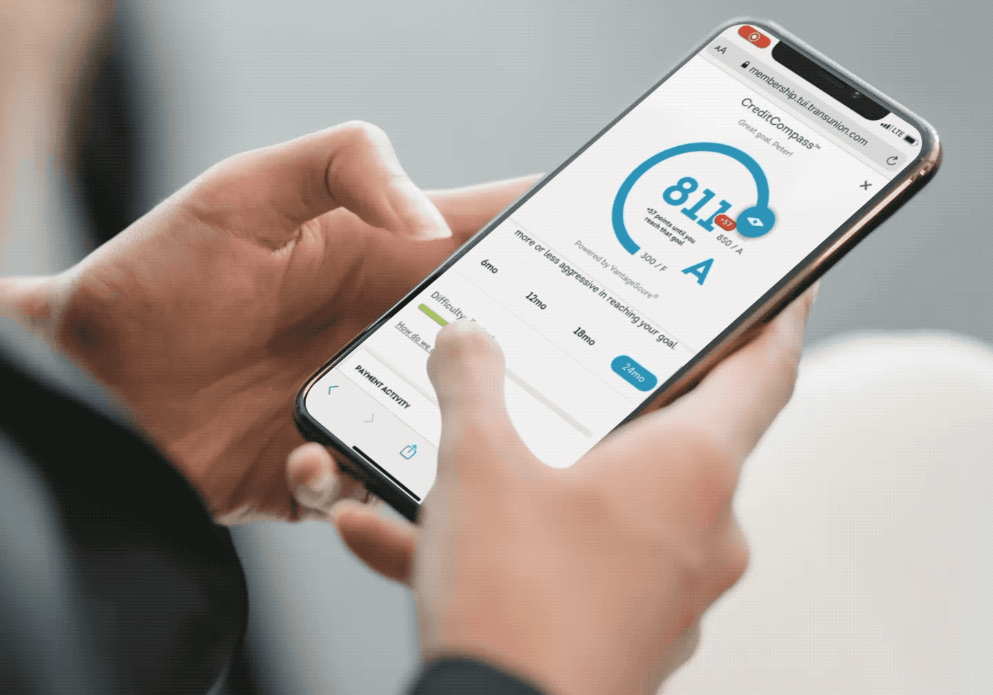
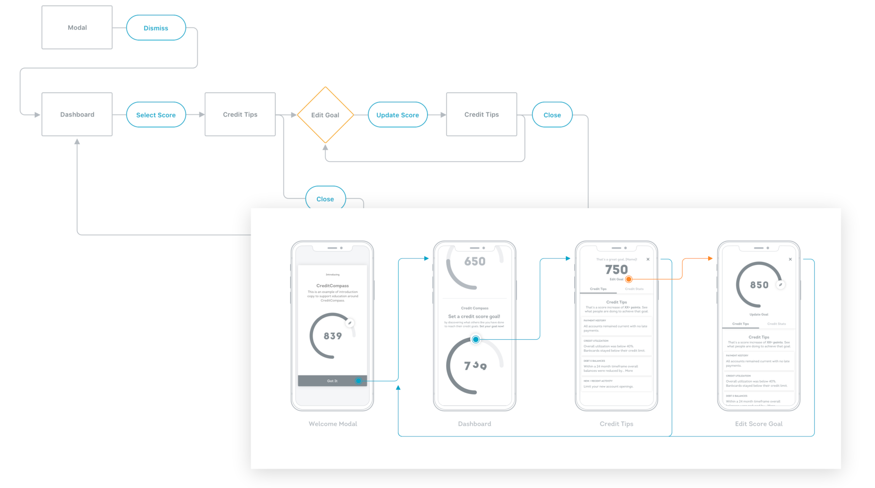
B2B2C Consumers struggled with TransUnion’s legacy Credit Score Simulator, a calculator-style tool originally designed as a headless API for partners. Partner implementations were too technical, overwhelming, and cluttered with promotions—frustrating users who wanted clear guidance to improve their credit. As Lead Designer, I partnered with researchers, compliance, and engineers to reimagine the experience as a first-party consumer-first product. We simplified the mental model, clarified content, and prioritized actionable insights, transforming the tool into an intuitive, gamified journey branded as Credit Compass™ that empowered and delighted TransUnion’s DTC subscribers and B2B2C partners.
Challenge & Task
Existing implementations were too technical, overwhelming, and cluttered with promotional content—leaving users confused and disengaged. Our B2B partners turned to us for guidance.
Executive leadership tasked my team with overhauling the product, starting with a consumer-first experience that could also showcase new capabilities to partners.
Until now, delivering the simulator to consumers had been repeatedly delayed due to regulatory hurdles and a backlog of B2B enhancement requests.
My challenge was to partner with compliance stakeholders, integrate new partner scoring data, simplify the legacy calculator model, and design an intuitive, engaging experience that built trust and helped users take action.
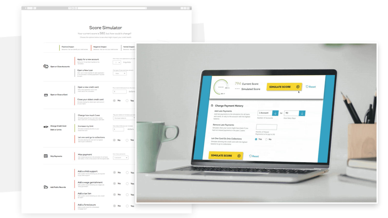
The legacy Simulator was a calculator composed of complicated financial inputs and outputs that was not intuitive for our partners or their customers.

We ideated less complicated mental models that were more emotionally resonant, and tested them.
Planning & Strategy
I partnered with UX researchers, compliance teams, and our external partners to test new concepts against existing API implementations with end-users.
We found that the calculator mental model was not intuitive and overloaded users with unnecessary information.
Key insights from users were that they valued actionable guidance over sales messaging, and promotions should appear later in the journey, not up front.
Established a product strategy prioritizing education, clarity, and user value first, with promotions layered contextually.

Scores of new partner data needed to be added to our model. I helped design a translation layer for our legacy system to parse the data and build front-end templates that enhanced the user experience.
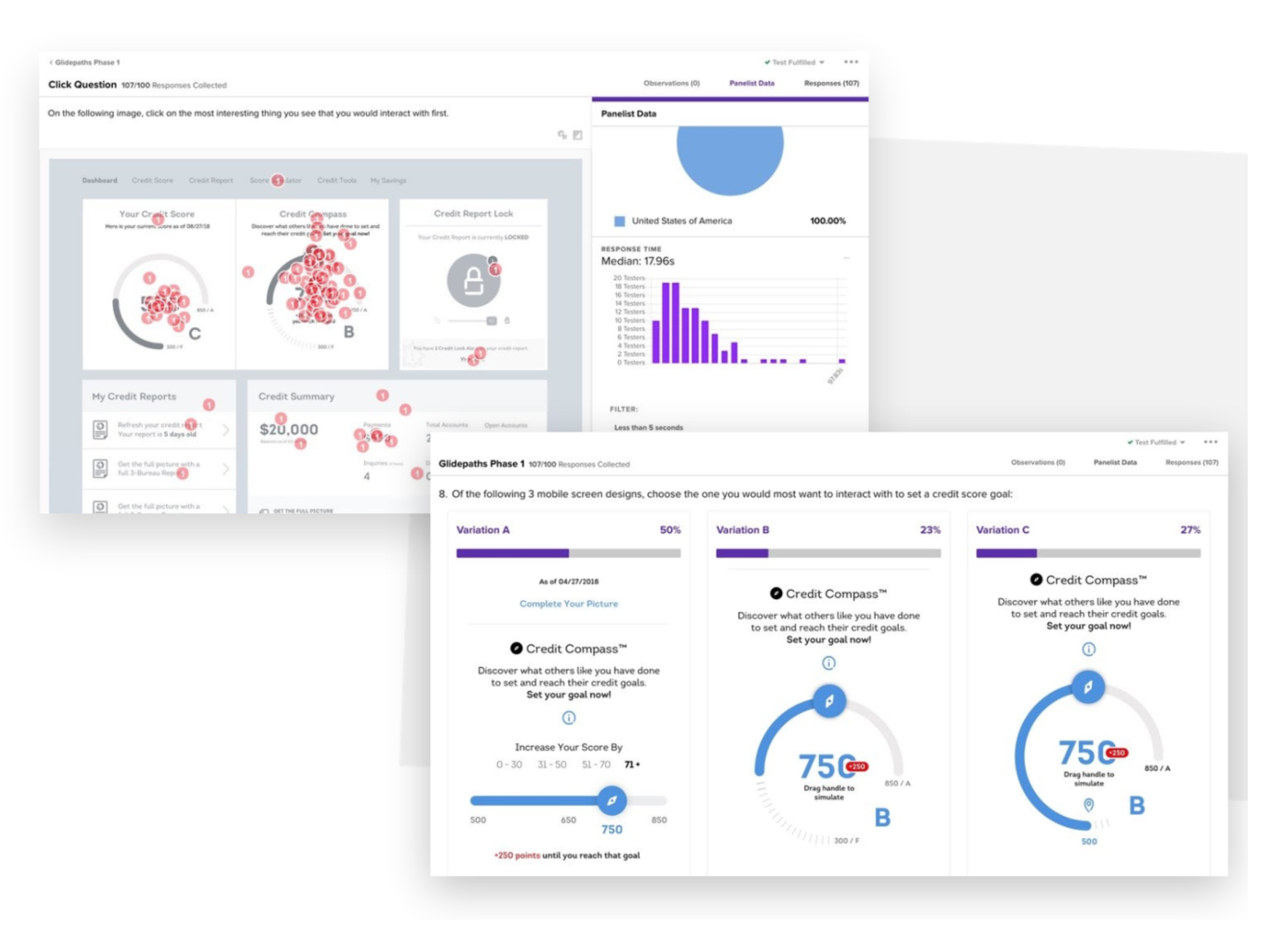
By reducing inputs and testing new interaction models with users, we landed on a design that users embraced, driven by behavioral triggers that drove content contextually and reduced cognitive load.
Execution
The previous content model was dated and limited front-end display and behaviors. I collaborated with engineering architects to design an ingestion and translation layer that integrated new partner scoring data into the back-end model, layering new object attributes into the front-end payload for greater styling and presentation opportunities.
Reframed the user experience around a simpler, behavior-based interaction model, reducing friction and cognitive load.
Redesigned the UI to present less information up front, with progressive disclosure and clear, actionable guidance.
Improved accuracy of scoring and made regulatory and educational content more digestible through simplified content design.
Led usability testing and iteration, validating improvements with real users before launch.
Solution & Impact
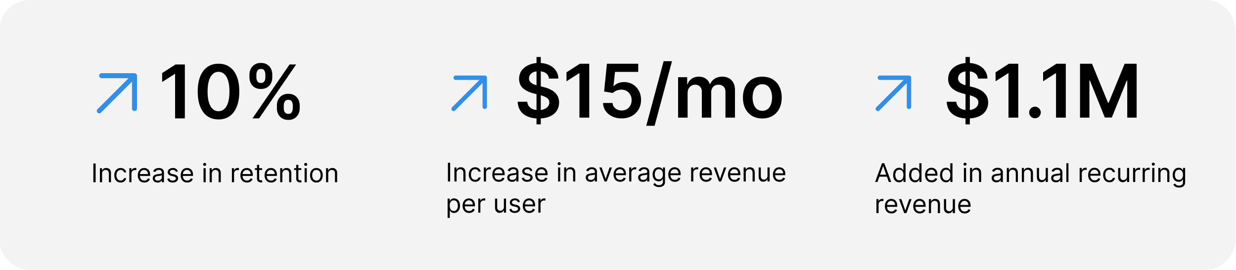
The consumer launch was a success that created new opportunities with our enterprise partners, increasing sales by 5x over the following three years, in part from the creation of a new hosted white-label B2B2C solution for partners.
Consumers received clear, actionable guidance for improving credit, replacing confusion with confidence and engagement.
Simplified flows reduced cognitive load and made regulatory and educational content easier to understand.
Gamified credit-improvement journeys increased motivation and sustained usage.
Partners benefited from a cleaner, more intuitive showcase product, making TransUnion’s capabilities easier to demonstrate.
The redesigned product improved adoption and retention in TransUnion’s DTC subscription line while strengthening relationships with B2B2C partners.